
Case study / Heroes of Fortune
How USP-first portrait screenshots beat a winning Google Play listing
How prioritizing the game's clearest selling points helped a portrait screenshot redesign outperform the previous Google Play listing.
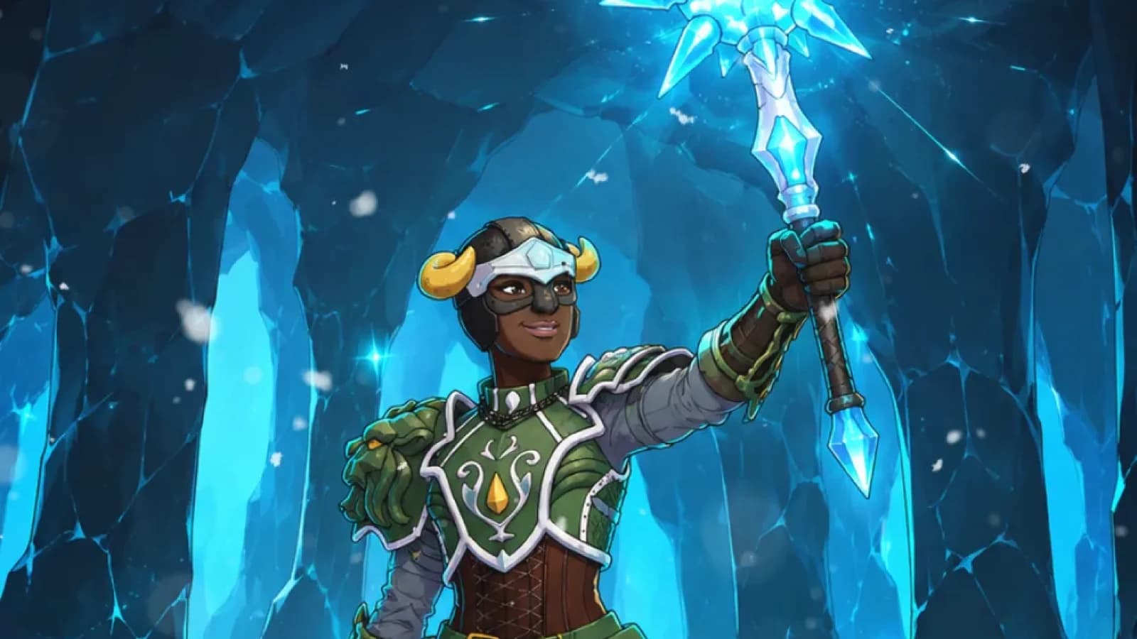
The challenge
Heroes of Fortune is a portrait mobile game, but the screenshot set that had been performing best on Google Play used landscape layouts.
The team had tested portrait screenshots before, but those versions did not perform as well. Even though the game itself was played vertically, landscape had become the winning direction because it made the mechanics easier to show.
At first glance, that made sense.
But I believed the real issue was not portrait versus landscape.
The real issue was what the screenshots were choosing to say first.
The problem with the old screenshots
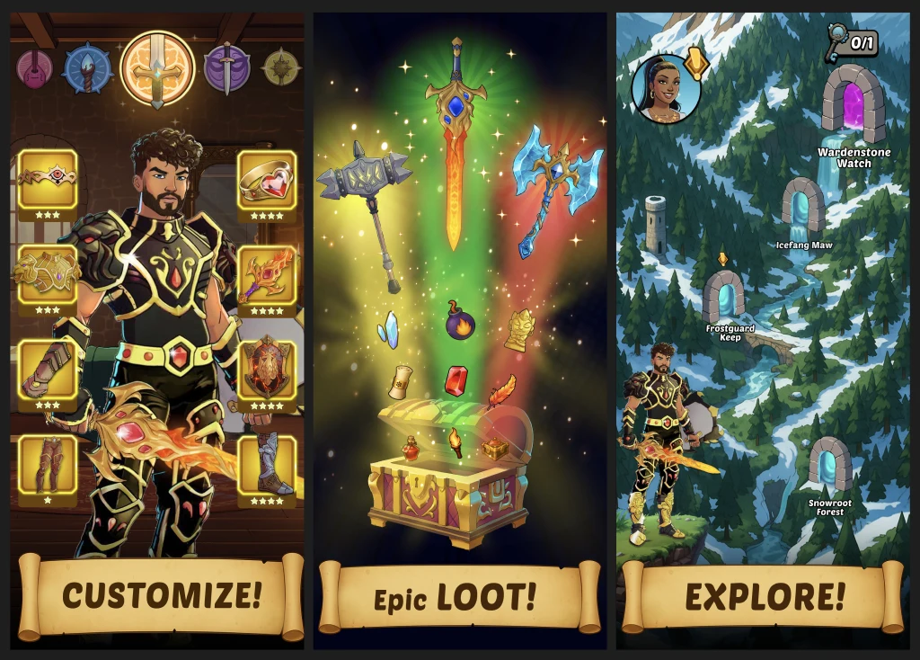
The older portrait screenshot sets were not leading with the strongest selling points of the game.
Instead of immediately showing the core fantasy, genre, and main gameplay hook, they opened with more minor features like customization and map exploration.
Those features are not useless. They just are not the strongest reason to install.
When someone lands on a store page, especially on mobile, most people are not going to read the description carefully before deciding whether the game is for them.
The screenshots need to do that job first. They should quickly answer:
- What kind of game is this?
- What is the main goal or fantasy?
- Why is this interesting?
- Why should I install this instead of scrolling away?
If the first screenshots focus on secondary systems, the listing can miss its best chance to sell the game.
What the landscape screenshots got right
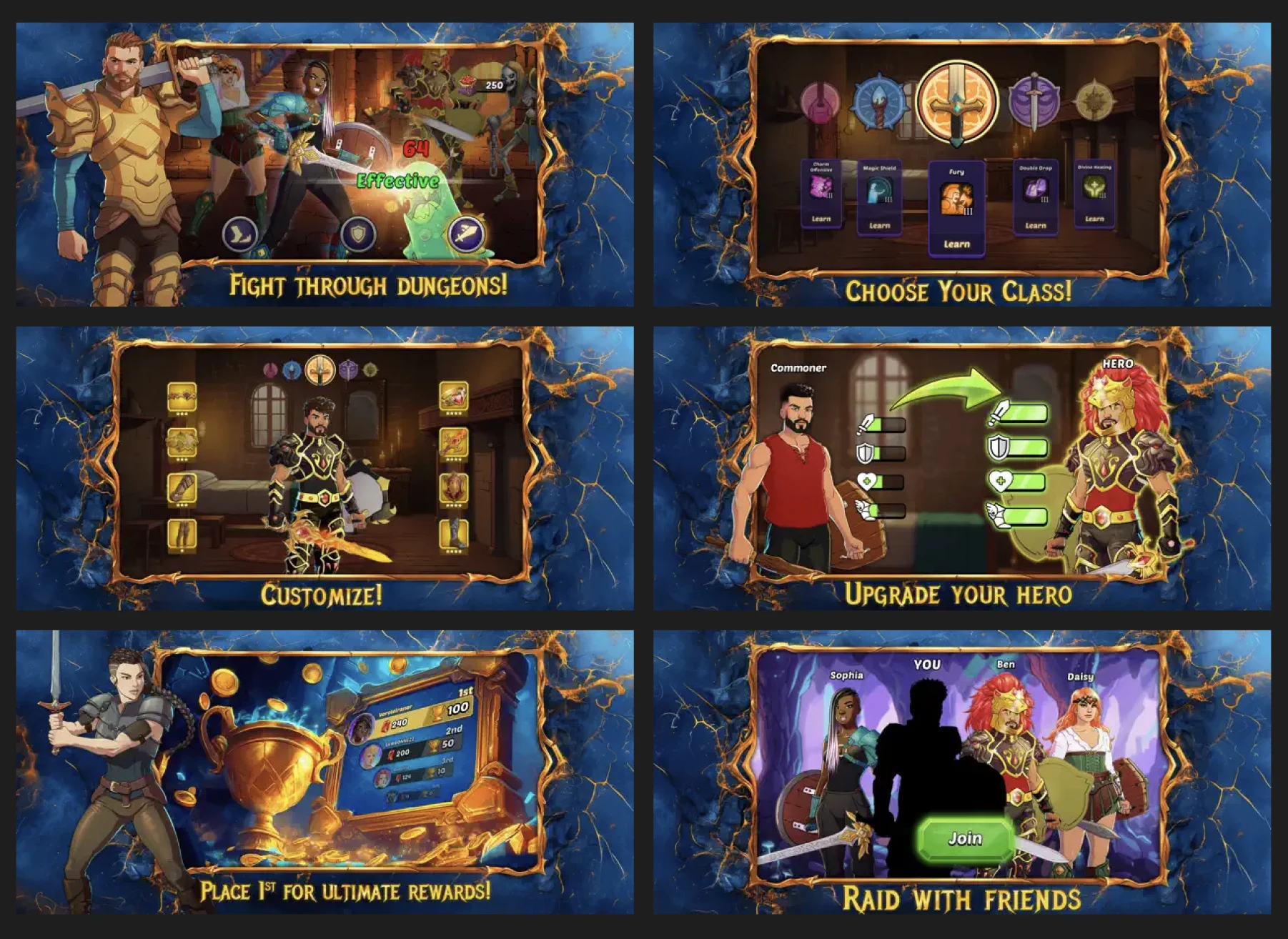
The landscape screenshot set had one clear advantage: it gave the team more room to explain the game mechanics.
That made it easier to communicate what players actually do and helped it outperform the earlier portrait attempts.
The landscape winner was not random. It solved a communication problem.
But it still had two limitations:
- It used a landscape presentation for a portrait game.
- It was not fully focused on the clearest USP-first messaging.
Instead of asking whether to keep landscape or switch to portrait, the better question was:
How do we make the game's selling points obvious immediately while keeping the screenshots aligned with the actual portrait gameplay experience?
The strategy
The goal of the redesign was not just to make the screenshots vertical.
The goal was to make them sell the right things in the right order.
1. Lead with the strongest selling points
The first screenshots should immediately communicate the most compelling parts of the game, not side features.
2. Make the genre and gameplay fantasy obvious
A user should understand the type of experience quickly, even without reading the description.
3. Use portrait as an advantage, not a limitation
Since the game is played vertically, the screenshots should feel closer to the actual play experience and set expectations better.
4. Treat screenshots as the first pitch
The store description supports conversion, but the screenshots should already do most of the heavy lifting.
The new screenshot direction
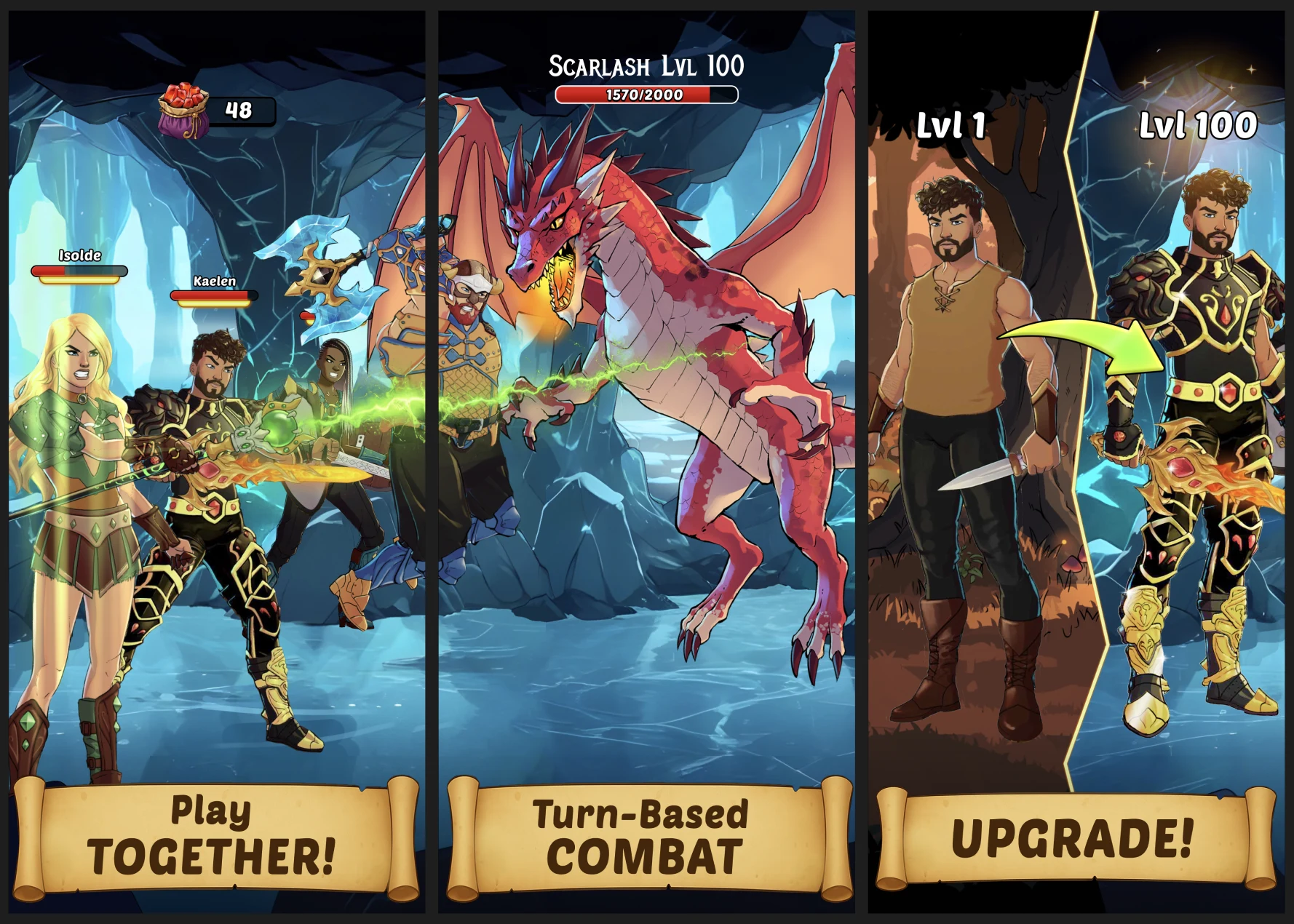
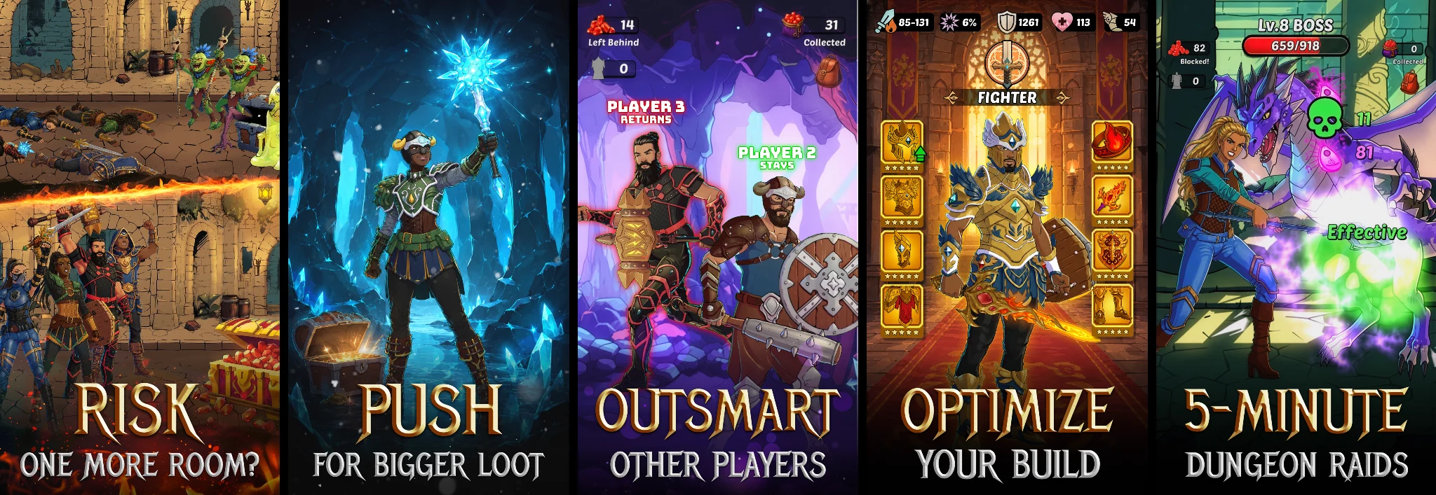
The final screenshot set was built around the game's core hooks and positioned them earlier in the sequence.
Instead of opening on lower-priority features, the new order focused on what actually sells the game first.
That gave the listing a better chance to communicate:
- the core gameplay loop
- the competitive and strategic tension
- the progression fantasy
- the stronger reasons to install
This was the key shift.
Not just portrait screenshots.
USP-first portrait screenshots.
The result
The new screenshot variation outperformed the previous Google Play listing.
Client-reported performance lift:
- +14.6% first-time installers
- +5.2% retained installers
This matters for two reasons.
First, the redesign improved install performance.
Second, it did so while presenting the game in the same orientation players actually experience after installing.
The new direction was not just stronger at attracting attention. It was also better aligned with the real product.
Why this worked
This result was not just about switching from landscape to portrait.
It worked because the screenshots became clearer about what the game was actually selling.
The earlier portrait sets underperformed because they did not prioritize the most compelling hooks. The landscape set performed better because it communicated mechanics more clearly.
The winning redesign combined both lessons:
- keep the communication clear
- lead with the strongest hooks
- match the screenshot format to the actual game experience
That is the real takeaway.
The playbook lesson
If your screenshots are not converting, do not just ask whether they look good.
Ask whether they are selling the right thing first.
A common mistake in store creative is giving premium space to features that are real, but not decisive.
Customization, maps, extra systems, and side modes can help support the listing, but they should not push aside the core reason someone would want the game.
The first screenshots should usually communicate:
- the genre
- the core gameplay
- the main fantasy
- the strongest USP
Most users will judge the game from the screenshots long before they read the description.
Client feedback
Included Games later shared that the new screenshots were beating the old ones on Google Play and wanted to roll the updated direction out to iOS as well.
Working with Louis felt like working with a member of our own team. We were impressed with how quickly he understood what makes our game different and used his creativity and skills to communicate that to our potential new players.
Final takeaway
This case study is not really about portrait versus landscape.
It is about message priority.
If the first screenshots do not communicate the game's strongest selling points, the listing can lose before the user ever reaches the description.
The winning direction for Heroes of Fortune worked because it answered the most important store page questions immediately:
- What is this game?
- What makes it interesting?
- Why should I care?
Once those answers became clearer, the performance followed.
From Included Games
Louis is brilliant to work with. Smart, creative, professional and worked well with us on several iterations to achieve great results. Very easy to recommend him!
- Mike Heywood, Co-founder, Included Games